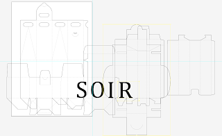
I have overlain the nets on illustrator one by one so I can match up where one letter overlaps onto another net and how to space the letters evenly.
Something else quite important that has come to my attention is the accent on the first E and whether or not it is appropriate to put in and whether or not it is appropriate with the uppercase letters.
Also realised that the 3rd net isn't how it should be because the R isn't on the right face of the net. Going to have to make some alterations


No comments:
Post a Comment