Showing posts with label design sheets. Show all posts

Friday, 12 November 2010

Drink labels


I've been looking at shapes of labels, wrapping all the way around a bottle or partially. As I want to keep consistency throughout all products but differentiate the bottles to be different drinks then I think the best way would be to foil 'Soiree' onto the label and emboss the logo and screen print the drink description, varying the colours of the descriptions

Thursday, 11 November 2010

Descriptions


Originally I centrally aligned the text on each net for the descriptions but with playing around and looking at things like this on my design context how it looks good arranged to the side, then I tried aligning it to the right and much preferred the look of this.


 This one was a bit of a struggle and kind of put me off the idea of aligning to the right, however I tried to arrange it so it works, I still prefer it to the centred text


Descriptions ready to screen print


Monday, 8 November 2010

Logo

So after I tried embossing some of my ideas, I realised that the one I wanted to use was too wide and therefore wouldn't fit onto some of my nets. The obvious option was to make it smaller, however I am concerned that if I do this then I won't be able to cut them out because they are so small and intricate. 


I drew down a few quick ideas/options of how I could change it so it's thinner


I thought about making the 1 smaller but the thing I liked most about my previous idea is that the 1 was large and was the length of '1st' and 'class' larger than the 'st' like an actual stamp. I've also thought about changing the name to just 1st C, taking away the class or just making it 1st.  
Another option is to decrease the size of the 1 so its the same as the others or place the letters after '1' underneath so it's vertical.

Thursday, 4 November 2010

Logo


I am wanting to keep the logo quite minimal as I want to emboss it onto the packages and therefore I plan to keep it quite simplistic and also so because I want the overall look of the packages to be minimalistic to look  elegant and luxurious.

Tuesday, 2 November 2010

Product range


I tried out a range of ways that the word 'party' could be spaced out and arranged over the six boxes.
I would like to use a serif typeface as I believe it looks more traditional and sophisticated. I tried out the letters fitting onto all boxes by making them smaller and I also tried using larger letters which means that part of them have been cut out on some of the boxes but are hopefully still ledgible.
I think the best design is the design with all uppercase lettering, where all parts of the letters are visible and read well alongside each other.


Here I've drawn the boxes in 3D to hopefully show how they would look as a range when made up. I am including three triangular boxes to hold sandwiches and I also want to create some labels for bottles and hold these within a drink/bottle holder. Hopefully this will conclude the range.


Logo ideas


After looking at a range of names I decided on First Class as to emphasise the fact that I want the range to be top of the range and luxurious. I wanted to keep it simple as I want to emboss the name/logo onto the packages and so would look good if it was just type. I looked at stamps, their basic outline and perforation to get some ideas, above are some quick ideas I've come up with but I'm not sure any are really of a good enough standard yet I need to develop them more.

Monday, 1 November 2010

Net considerations


I drew out a range of nets I liked and discussed how they would or would not be suitable to package food for my range. I have looked at tall, elegant boxes along with unique shapes and a range of styles so they aren't all the same when put together as a range, I would like some variety in the boxes not just a repeat of the same box with a different design on.

Thursday, 28 October 2010

Packaging- die cutting ideas


Ideas-
  • Different colour behind the die cut area
  • Die cut letter with photograph of the food behind
  • Die cut letter with plastic/acetate behind to show the product inside
  • Die cut letter with a pattern behind it
  • Die cut with text, repeated word behind
  • I think if I used die cutting with acetate, when the boxes are all put together with the different foods it might work quite well then again it might be too much.
  • This idea has been inspired from my design context research here My design context

Packaging- photography ideas


Ideas-
  • Range of ideas
  • Majority of package being the photo of food
  • White background so photo blends in looks elegant
  • Photo with the letter embossed into it
  • Letters filled with the photo of the food
  • The photo being the main focus, tiny names could be embossed or foil blocked
  • Strip of photo
  • Strip of photo with brand name die cut out or foil blocked
  • Photo split into two

Packaging-Embossing/foil blocking- ideas


Ideas-
  • Foil block the large letters with a small embossed brand name centred towards the top of each package
  • No actual print onto the boxes just print techniques, however for small writing this may be difficult
  • Party is just for design, should probably think of a better word although the range is for 'party food'

Packaging Mini range- ideas


Ideas-
  • All packages to be mini for a mini range
  • Still want packages to spell out something like my wrap it up brief, when they are put together
  • Could be name of brand or just spell out an associated word
  • Or each package could just have an individual word on it, however I like the idea of them working together as it makes it more of a range
  • I want to include some jars and bottles-labels

Monday, 18 October 2010

Wrap it up- design sheets

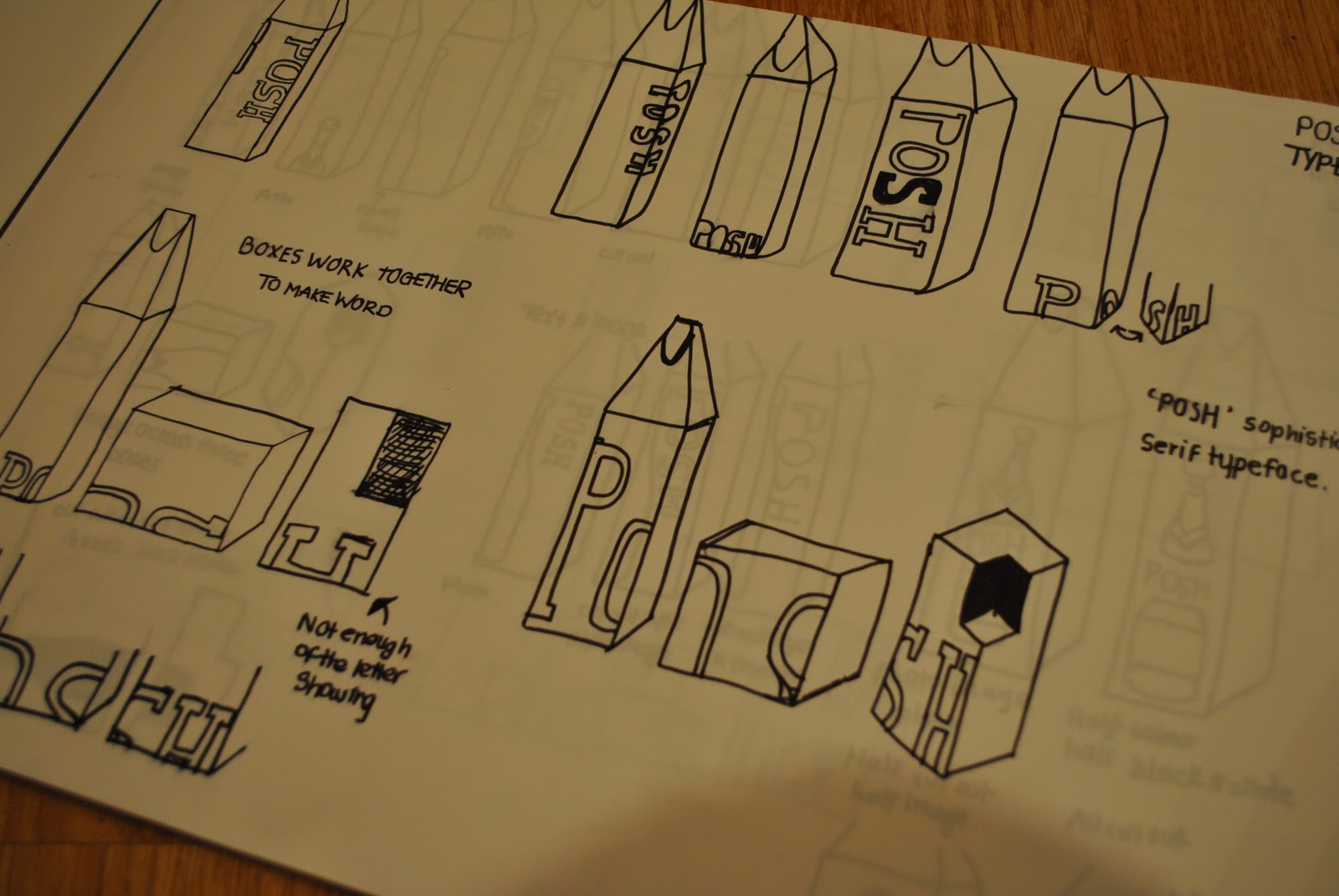
 I firstly looked at just using type onthe boxes, indivuidually and also working across the three boxes to spell out the word. I prefer this idea, I would like them to work as a set. 

 I then looked at using image, I don't really have a strong image  but I tried out a champaigne bottle to se ehow that would work, I found it quite hard to decide on a image that would represent 'posh'. I contemplated the ideas of using a photo which would have to be tinted or a cut out silhouette style. Also looked at using type and image on the boxes again working across the three boxes.