Showing posts with label embossing. Show all posts

Wednesday, 17 November 2010

Drink labels


Production

 I foil blocked my nets, turns out the black worked best however unfortuntaely I'd already made the decision to use alternative colours, black and silver. Obviosuly I should have tried the silver out earlier but it was a last minute find and I just really wanted to use it

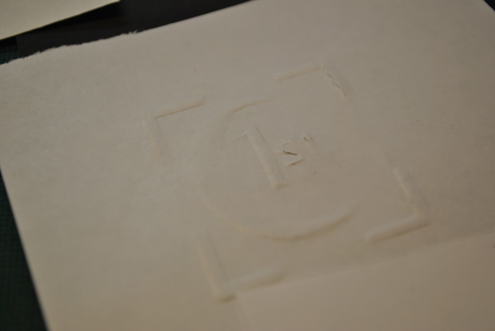
 My embossed logo on the triangular boxes, I like the embossing on the silver stock it's more prominent, shame the foiling doesn't work so well. Going to have to just photoshop it for my magazine page etc to improve the quality.
 Quick mock up of a drink label, I'd like to use a long label like this so there is a lot of black covering the glass.

Thursday, 11 November 2010

More embossing

I attempted to make a 3d stamp to emboss in the print room using the wheel with raised letters on card, however I don't think the letters were raised enough in order to produce a deep enough emboss.


I've been trying out more variations of my logo as using the whole two words "1st class" is proving to be too long and difficult to get accurate when cutting out. I am contemplating screen printing the 'class' underneath the 'st' or leaving it as just "1st" because I do quite like the look of it and it fits a lot easier onto each net

Monday, 8 November 2010

More logos


I can't make a good logo.
I need my logo to be simplistic, minimal lettering and I want it to include 1st. 


I am unsure whether I should simplify it down to 1C to stand for 1st class but then again I want to include 1st to have the sense of importance.


This looks bad on screen but when I embossed it previously I liked the effect of having the corners around the lettering, I'll try embossing this with and without


The C looks like a moon because the serif hasn't embossed well, it is really difficult to cut out neat letters on such a small scale.


I want to stick with the design I tried out but was too big and somehow make it a scale that will work, I like this design best and I like the fact it has resemblance of a stamp.


I have decreased the kerning so that the space between the letters, where it needed to be, is less, in order to make my logo smaller. I have also moved in the four corners but I'm not sure if I want to use them, although I did like the way they turned out when I embossed them.


Embossing


I struggled quite a bit with cutting out letters which include curves like 'S' and 'c' and started to think that I may have to rethink my logo


Managed to cut out an 's' but it looked very rough however when I embossed it it managed to not pick up this rough edge


I then attempted to cut out the whole word class, it wasn't too bad, not too rough but far from perfect


And this is the result, I like this logo with the four corners, one major problem I came across though is that this logo is too large to fit across the face of some of my packages, I want the logo to be quite small and elegant but I'm afraid that if I scale down the logo any more I really won't be able to cut out the letters for the template.


My Design Context

Thursday, 4 November 2010

Embossing

Made a quick stencil with card to try out embossing


This is just rough but I really like the outcome, I can imagine it would look really nice on black card