Resolution: 300
Bitmap only contain black and white pixels.
Increasing the bit depth means more colours are available. eg 8bit
RGB- display a wider range of colour larger than available to print with CMYK.
When converting RGB to CMYK the colours come out duller.
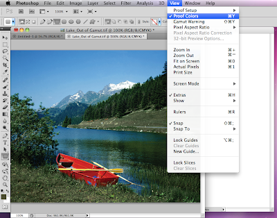
 View- gamut warning- the grey shows problem areas, areas in which would cause a problem when you come to print because they are not within the CMYK gamut.
 you can tweak/ adjust the image to lessen the non printable colours.
 You can do this by image- adjustments and changing the hue and saturation.
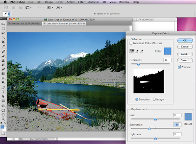
 likewise, you can use the replace colour option, choosing a section on the image and adjusting the colour to a suitable printable colour.
 Another option to alter these colours is to proof colours. The title will read RGB/8/CMYK.
This shows the colours as they will be printed in CMYK and so if you then change the mode to CMYK there should be no change.
 Swatches

 Swatches
You can access the swatches by clicking window and swatches, this will bring up a selection of default swatches.
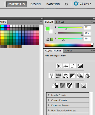
 When choosing a colour if you pick one which is outside of the gamut then this small warning sign will appear next to the square of colour informing you of this, therefore allowing you to choose another colour.

 When choosing a colour if you pick one which is outside of the gamut then this small warning sign will appear next to the square of colour informing you of this, therefore allowing you to choose another colour.
 When this warning sign appears, by clicking on the small square under the warning sign, this will pick a colour as similar to you choice but within the gamut. Therefore when you proof colours it shouldn't change because its in the printable range.
 To delete current swatches hold alt and click the swatch. You can then add your own swatches.This can be done from the foreground colour along the left hand side tool bar. When in this option simply choose your colour and click add to swatches.
If you use the eye drop tool on an image this creates your foreground colour and can then add to swatches. this therefore means that you can create a palette based on an image.
 A spot colour- creates consistency, allows you to choose a colour outside of CMYK, it is also cheaper if you are using only two colours only using two printing plates.
 A spot colour- creates consistency, allows you to choose a colour outside of CMYK, it is also cheaper if you are using only two colours only using two printing plates.
Creating a duotone image- the image has to be grayscale to start with.
If you click the first square and then colour libraries, you can select you spot colour.
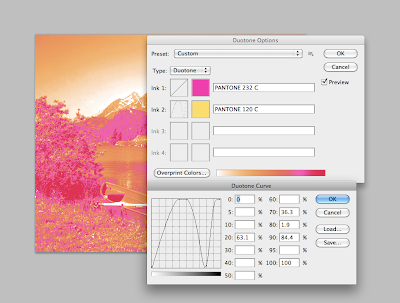
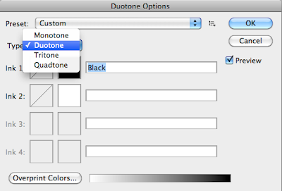 As it is a duotone, select a second colour to work with your first. By changing the curve, you can change the levels of the colour and how much of each colour is shown.
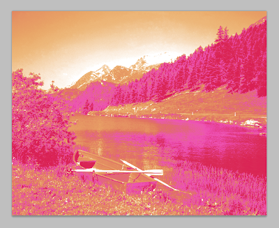
 Duotone image
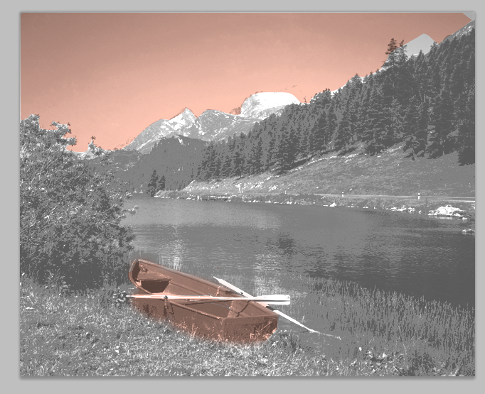
 Channels- a channel shows how a CMYK image is made up, shows the amount of each level.
 As it is a duotone, select a second colour to work with your first. By changing the curve, you can change the levels of the colour and how much of each colour is shown.
 Duotone image
 Channels- a channel shows how a CMYK image is made up, shows the amount of each level.
 You can create a new spot channel.= and select an area of an image to change the channel. Below I have selected the sky. You can change the solidity of the channel but the more solidity the less realistic the image will look, this has 0% solidity.

No comments:
Post a Comment