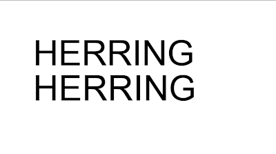
Kerning would be improtant especially in branding.
Look for the biggest space between letters and then adjust the rest of the letters to match this.
Mathmatical and visual judgement- is there any white space which doesn't look right in comparison to the space between other letters.

 One, two, three, four. In an order in which your eye will read one first.

 So that your eye reads one first then takes you down to the bottom of the page and then to the top in order of one, two, three, four


 In layout it uses a visual hierachy, guiding the reader around the page.
Splitting a heading- the reference for this is speech, when you take a pause in a small sentence this is where the break in the healine or heading would be.
No comments:
Post a Comment