Friday, 12 November 2010

Drink labels


I've been looking at shapes of labels, wrapping all the way around a bottle or partially. As I want to keep consistency throughout all products but differentiate the bottles to be different drinks then I think the best way would be to foil 'Soiree' onto the label and emboss the logo and screen print the drink description, varying the colours of the descriptions

Thursday, 11 November 2010

More embossing

I attempted to make a 3d stamp to emboss in the print room using the wheel with raised letters on card, however I don't think the letters were raised enough in order to produce a deep enough emboss.


I've been trying out more variations of my logo as using the whole two words "1st class" is proving to be too long and difficult to get accurate when cutting out. I am contemplating screen printing the 'class' underneath the 'st' or leaving it as just "1st" because I do quite like the look of it and it fits a lot easier onto each net

Descriptions


Originally I centrally aligned the text on each net for the descriptions but with playing around and looking at things like this on my design context how it looks good arranged to the side, then I tried aligning it to the right and much preferred the look of this.


 This one was a bit of a struggle and kind of put me off the idea of aligning to the right, however I tried to arrange it so it works, I still prefer it to the centred text


Descriptions ready to screen print


Typeface for descriptions


I initially thought Times New Roman would work best because it is traditional, universal but also has a sophistication about it. I am also considering using Cambria bold because this would be consistent with the typeface used for the lettering on the front of the packages. I don't want to use more than two typefaces on the overall packages but I would like them to all be serif typefaces.

Typeface: Cambria
Position of text too high on the net


Position not suitable as price and barcode would be positioned at the bottom

Typeface: Times New Roman
I prefer how the Times New Roman works on the box, I have split up the text where pauses are taken, like we learnt in the type workshop with Graham. I also like that Times New Roman 12pt is smaller

Wednesday, 10 November 2010

Foil Blocking

Selection of foils they have in the print room:

Originally I was set on using silver but after seeing the range available I am keen to try out the champagne and pewter.

Our screen with designs on in which we glued, then left to dry completely to foil later
The glue 


Some didn't work so successfully with the glue because it dried pretty quickly but these below worked well, just need to put the foil ontop


I really like the black on black, I was initially worried that it looked like a bin bag but when I put it under the heat press it turned out really nice. I think it portrays the look that I want, kind of sophisticated however, I also really like the pewter which is kind of a pearly silver, much nicer than standard silver which actually looked a bit tacky. 


Some of them were a bit patchy because the glue didn't take to parts of the stock but for the final design I would ensure I did everything properly.
Whilst in the print room I also asked about screen printing colours like metallics and fortunately they have a gold, silver, bronze and pearly silver so I would like to possibly try this out for the descriptions.

Colour test


Monday, 8 November 2010

More logos


I can't make a good logo.
I need my logo to be simplistic, minimal lettering and I want it to include 1st. 


I am unsure whether I should simplify it down to 1C to stand for 1st class but then again I want to include 1st to have the sense of importance.


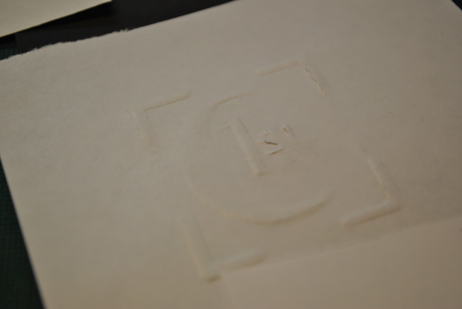
This looks bad on screen but when I embossed it previously I liked the effect of having the corners around the lettering, I'll try embossing this with and without


The C looks like a moon because the serif hasn't embossed well, it is really difficult to cut out neat letters on such a small scale.


I want to stick with the design I tried out but was too big and somehow make it a scale that will work, I like this design best and I like the fact it has resemblance of a stamp.


I have decreased the kerning so that the space between the letters, where it needed to be, is less, in order to make my logo smaller. I have also moved in the four corners but I'm not sure if I want to use them, although I did like the way they turned out when I embossed them.